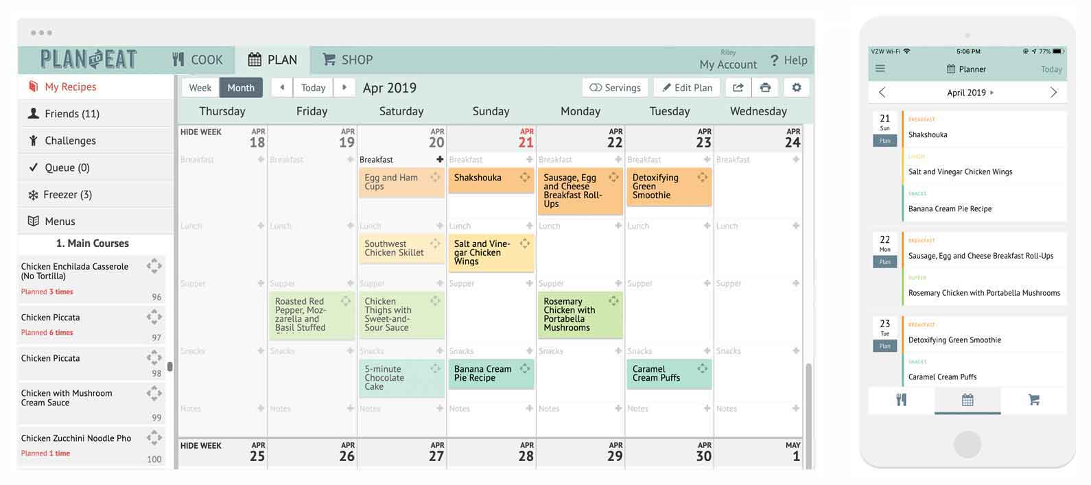
In case you haven’t already noticed, the Plan to Eat website, including our desktop app, blog, and customer support site, has a new paint job!
While the content for our homepage and tour are different (go check it out!), we have primarily changed the color scheme for our desktop app so it looks more consistent with rest of our brand; specifically our iOS and Android mobile apps. This style update has not changed, moved, or removed any of our existing features. Everything you love about Plan to Eat has stayed exactly the same!

As we continue to work to update the app and include the features we offer on our desktop site, we wanted to also make sure that we didn’t neglect the appearance of the desktop site. While our main focus is, and always has been, to make planning meals easier for our customers, we were excited to make this change for the overall appearance of Plan to Eat. And don’t worry, we also have some exciting new features planned for our desktop site this year.
Plan to Eat will be 10 years old in July 2019, and we are truly thankful for all of our customers making our mobile apps and continued updates possible. Plan to Eat has never been better and we are so thankful for all of you!


